Posts

Later than Never

Image
Far longer than anticipated here is a nice mix of items from various designers who took part in an event, released it at their store or is gifting it as a hunt prize.  My style is not to photoblog because that tells us nothing about the items themselves.  However, in this instance due to the lateness of the posting I shant be all wordy :) Hair: ChiChickie! - AJ - Cosmopolitan Sale Room *Find AJ at Cosmo Sale Room!!* Skin: WoW Skins - Tanita CL - Gift from The Black Fair 2013 Makeup: *Mon Cheri*   - *MC* Red Glossy Lips Gift from The Black Fair 2013 Necklace & Earrings: Stars! - Bubbles (Grayed Jade) (Not Free) Top: the second star : The SPH Prize - **Seasons Palette Hunt Gift** Pants: Lumiere: Belted Pants Naturals ** Exclusive at Cosmopolitan Sales Room** Heels: Flame Fashion - Sena Mesh Shoes Cream (Not Free) Wrist Bands: {Mes petites Coutures} : Manchette Wrist Bands - **Seasons Palette Hunt** Sunglasses: U Refined: {U.R.} Fashion Glasses Summer Edition Bree

Another Round of Black and White

Image
I love black and white!!  A revelation discovered while setting up to blog items from The Challenge - Black and White Theme.  Not one alone but a happy mingling of both.  Without a doubt the right backdrop has to be chosen in order to get the "wow factor"  as opposed to the "wash out".   ChiC Building offered up Gothic Building this round (details in previous posting); it in conjunction with a few other goodies make up the 'wow factor'.  In case you missed it, Black and White is the theme for July Challenge for Builders. [bauwerk] put together a whole slew of white for you to pick and choose from.  It is not a set but individual pieces that work beautifully together.  The Chesterfield sofa is leather and pairs perfectly with the Leather Stool .  Each have great animations for singles while the sofa has couples as well.  The land impact is very low at 11 for both items.  The floor lamp works on touch and is only two prim as well.  The Monochrome Couc

Gothic Building is Prime Location

Image
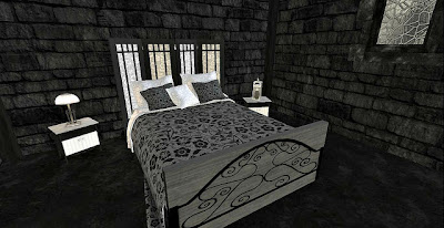
A dark stone building holds secrets of owners that only the walls do know.  Each crack and crevasse tells a tale like no other, never to be told.  It's eerie features are shadows cast from nearby trees that sway in the breeze and whose branches shiver in the light of the moon.  The smooth opening doors do not creak as they open wide revealing a spacious room inside.  Two windows to the left and two to the right are the building only means of filtering in natural light.  It's dim at best through the frosted stained glass.  A sleek stone floor from one end to the other is cold on the bare feet pitter pattering from the door to the back.  Gothic Building by ChiC Buildings for The Challenge, Black & White Theme, lends itself willingly to having furnishings scattered about in hopes of being photographed.  Such a truly awesome build to be offered at only L$900, a 25% savings during the first release week.  It measures 12 x 28 and is only 46 Land Impact with original mesh used i

Black, White & Some Color Too

Image
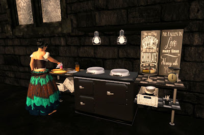
Up for a challenge?  These folks sure are!  In this months theme you'll find that sometimes it's all Black & White :) ! Follow Us ! has hit a home run in this challenge with their "Happiness Kitchen" .  This vintage kitchen stove and workspace is beautifully detailed from the shiny silver burner covers to the checkerboard tile counter work area.  I love the chalkboard style text art situated underneath the overhead shelf.  Really fun industrial style work lights are a nice touch as well. It is an animated addition to your home decor that allows cooking for one or two.  Need to chop some veggies?  There's an animation and a prop for that!  Need to slice the bread while your partner drinks coffee?  Yep, there's props and coordinating animations for that too.   All the added decor really add to the realism of the kitchen.  A scale, covered cake plate with cakes, dishes .... it's the little things that add character.  This kitchen definitely has p

Black & White Challenge - Cleo Designs & [hate this}

Image
The time has come for another round of The Challenge for Builders.  Words like gorgeous, beautiful, outstanding, awesome don't really begin to describe the creations released for this month's theme.  Black & White was opened ended and filled with possibilities for all who participated.  They all proved that imagination is indeed a wonderous thing.  While I hope to get all the designers blogged this week, someone had to be first.  Cleo Designs , owned by Cleom Bailey, has always been a favorite home and garden store of mine.  The pure creativity she puts in all of her work simply blows me away.  There isn't much that she builds that doesn't make me go "hmm, wish my brain worked like hers".  The set put out for this months Challenge isn't any different.  Fun, creative and most definitely black and white.  Fully loaded with animations too, excellent quality too. Armchair with Pouf (not shown) - 7 LI Armchair - 6 LI Daybed & Pillows - 7 LI

Summer Break by the Water

Image
Home and Garden is an often neglected genre of design in the blogging world.  By no means am I saying that there are no folks who absolutely adore the task of dressing up the space they live in or even setting up a scene for a photo.  Me?  I love the ease of tossing out a fully decorated building whether its to blog it, live in it or both.  Why?  Because as a builder / store owner I very much appreciate the time and effort other home and garden creators put into their designs.  The Mesh Beach Hut from *RnB* Design is a prime example of simple spaces fully furnished with all the must haves for a day on the beach, lake, creek .... um next to a pond even.  What?  I don't have a beach so I use what I got.   It's texturing is cool blue walls and darker roof with salt water & weather worn posts and trim.  It comes complete with banner flags, beach ball, surf board, life bouy, a few chairs (decor only - not animated) and some sea shells too.  In spite of it being a "Be

Trace ~ The Dreamer's Paradise

Image
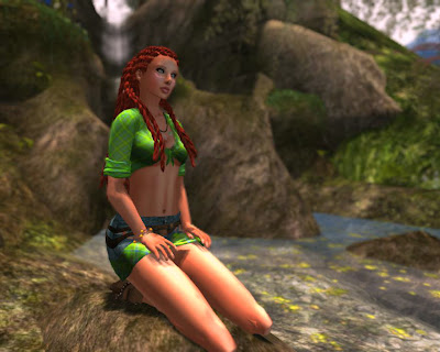
A 'splorin' we will go, a 'splorin' we will go!  The Trace is the location of choice to snap the shutter on the ole cam a few times.  It's another of those places from the handy dandy SL Destination Guide, a must read for those who find themselves among the "bored in sl" state of mind.  The Celestial Realm is the sim that holds The Trace.  It is a full on outdoor experience that is unbelievably relaxing and beautifully designed.  Lots of opportunity to add to your photo album, especially at the waterfall where there are literally tons of animations for one person or a couple.  Gotta love when the clothes you choose for the day fit seamlessly into one of the places you just happen to tp into. Discord Designs creates some of the most fun, funky and definitely unique braids that I have seen in a while.  This is actually the first style of braids that I have ever purchased.  I love it!  Found the store some years ago but since the styles weren't what